Design of My New Logo
Since a logo is one of the essential elements that recognize a website, I wanted from the beginning to design a logo that fits the theme of the rest of the design of the site.
Although I think that a private person does not need a logo. But without a logo is a nice visual element missing that can be used later in all sorts of places, for example as the favicon.
It was clear to me early that I wanted to use a Rakkan instead of a modern logo.
Rakkan
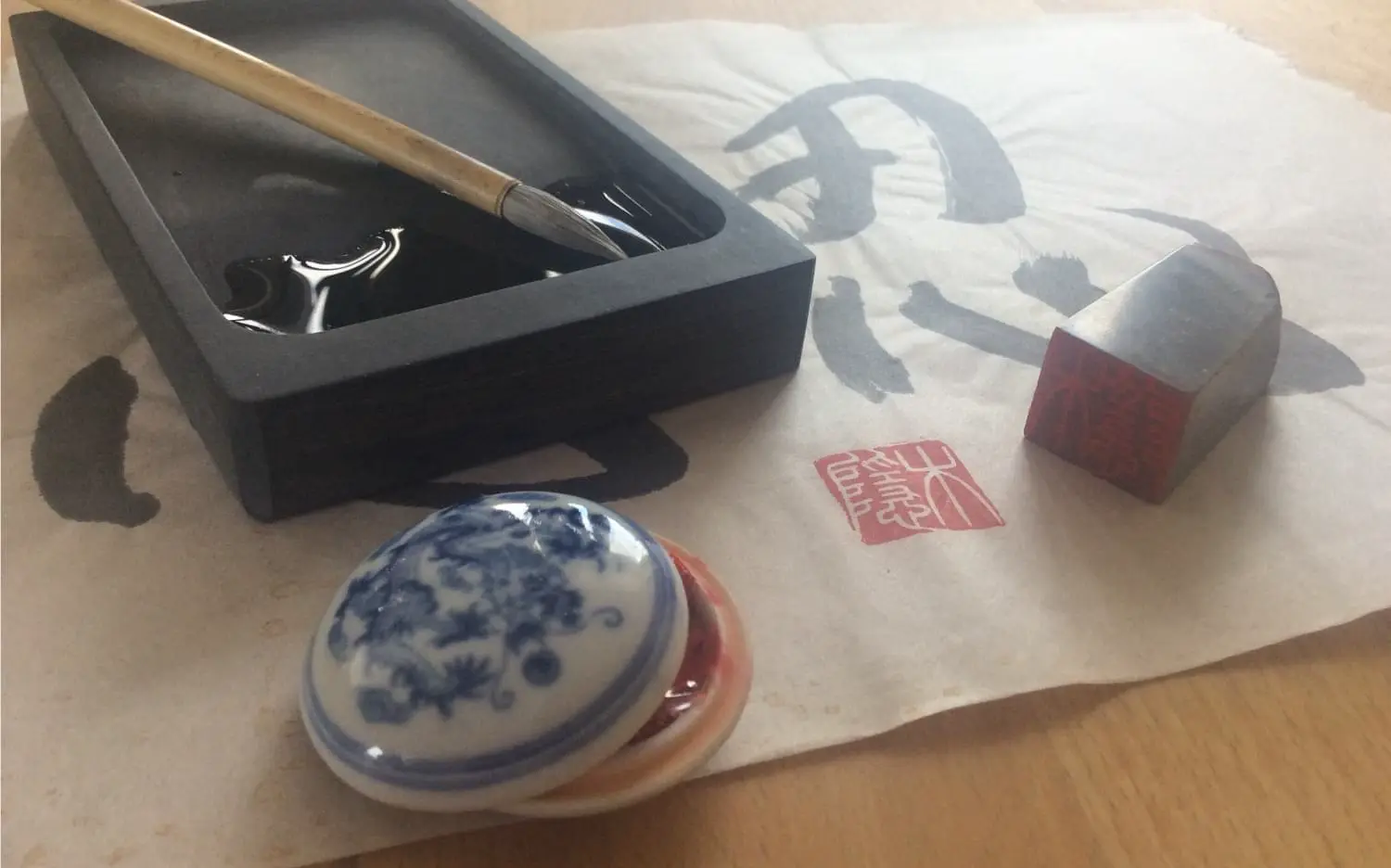
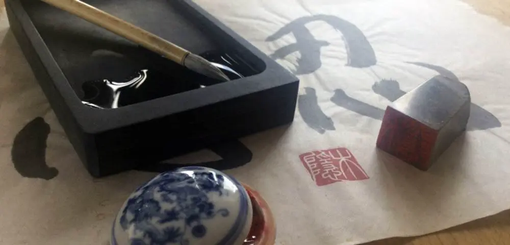
A Rakkan (or Hanko) is called in Japan a seal, which is carved in stone, representing the signature of an artist and is stamped under the artwork, and thus works as a signature.
Even with my martial arts portal, I use a seal as a logo.
Research
Before I could start designing my new seal, I first had to conduct research. For this, I have looked at historical stamps in numerous works and studied their style and characteristics.
Stamps use multiple characters, four or even more. They exist in all forms, with the angular shape seeming to be the most common.
The next step was to choose the right font. As a typeface, many artists pick the small seal script, which was introduced by the Chinese Emperor Qin Shi Huang about 2200 years ago.
Tour in Chinese Writing Styles
The first Chinese characters were scratched on potsherds 6000 years ago. The oracle bone script was developed 3400 years ago during the Shang Dynasty and was used for prophecy with animal bone oracles.
As the bronze casting technique around the 11th century BC the bronze inscriptions were developed, which were used to write texts for politics, trade, military, administration, and oracles.
At the time of the Seven Kingdoms (475-221 BC), brush and ink were invented and written on bamboo, wood, and silk.
However, there were many spellings of the characters, which was not conducive to exchange and trading. King Zhou Xuanwang tried to solve this problem through the large seal script, but he did not succeed. As Emperor Qin Shin Huang unified the empire in 221 BC, he ordered a uniform font. Chancellor Li Si eliminated characters and reduced strokes, thus founding the small seal script.
The small seal is indeed beautiful by its curved lines, but was cumbersome to write in everyday use. At the beginning of the Han Dynasty, the clerical script, had much straighter lines and was easier and faster to write. This font further abstracted many characters.
At the same time, the cursive script was invented, which is called grass font. It was used for private correspondence, but written by the common people. In this font, the strokes are connected. It looks like the brush has not been lifted off the paper.
In the 2nd century AD, scribes who disliked the concept of chancery script developed the regular script.
At the end of the Han Dynasty, there was another style for private use besides the grass script: the semi-cursive script.
The next significant change took place in 1956 when the government simplified the text. More than 1000 characters were deleted and with 2200 characters, the number of lines was reduced. This should lead to a better literacy of the population.
The Meaning of the Characters on My Rakkan
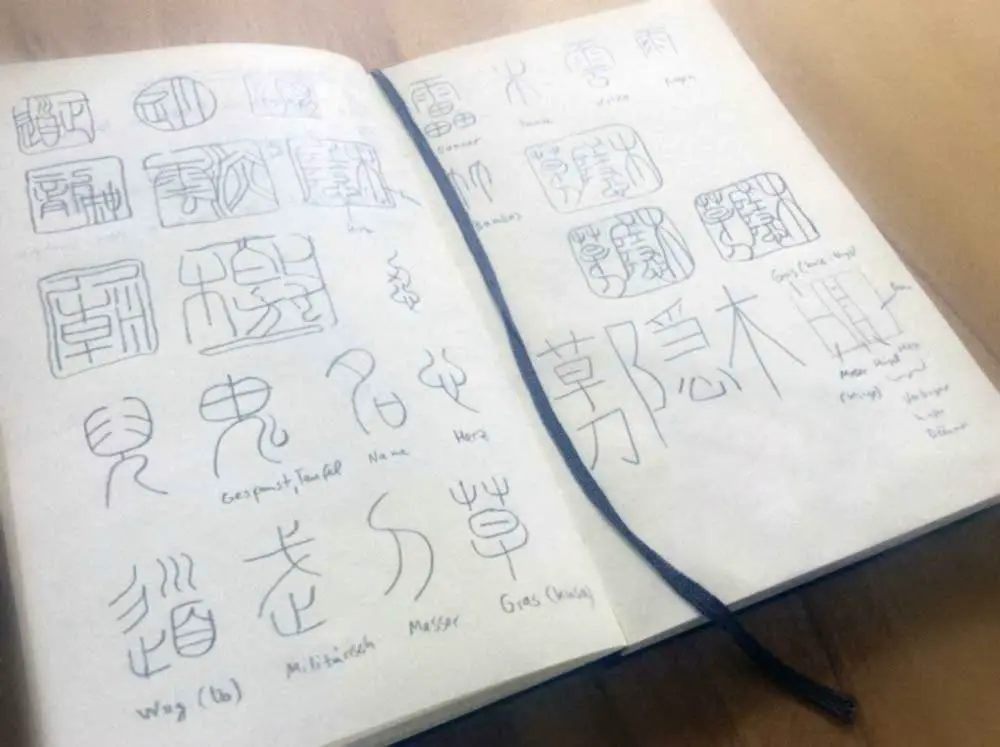
For my new Rakkan, I have taken over the characters of my old Rakkan and then added two more characters. The old character contains the characters 木隠 (kogakure), which is not only the name of my martial arts portal, but my pseudonym on the Internet for many years. Translated, it means hidden behind trees and leaves.
The two new characters to the left of it mean 草 (grass) and 刀 (blade) in the small seal script. The signs allow numerous possibilities of interpretation, which I will not go into here to get anyone bored.
A seal can be created in two different variants: Yin or Yang (☯). In the Yin variant (as I have it on kogakure.de), the letters are carved out of the stone, and the surface remains. This time, I wanted to create a rakkan in the yang variant where everything is cut away except for the letters (and an edge).
The Creation of the Rakkan
First, I made numerous pencil drawings, first of individual characters that I liked, and later of combinations. I wondered how an artist would carve a traditional stamp, how the letters touch and support to give the seal the necessary stability.
After I had developed my final variant, I drew the pencil lines with a thick highlighter (not without almost ruining my bamboo table, since I omitted out of laziness to use a pad). The texture that emerges when ink spreads through the paper looks much like a stone-carved edge.
In the next step, I then digitized the Rakkan and corrected it in Adobe Photoshop to remove unsightly parts or improve the lines.
To create a vector shape from this pixel image, I imported the image into Adobe Illustrator and converted it to a vector shape, then reduced the number of vector points and exported it as an SVG file.
To use my logo as a vector font on the page, I used Font Custom to convert SVGs into web fonts. Thus, several vector graphics are combined as a single character in a font file. Once the font is loaded, the icons can then be displayed in any size and styled with CSS.
The Font
Now the Rakkan can be used as a character and can be generated by a CSS class attribute on any element. Then, the character can be colored at will and get the desired font size or text effects (such as a shadow edge).